Celebrating 100 years with a new brand

Honoring the past.
Country clubs carry a deep sense of tradition, and in honoring that legacy, BKGD took inspiration from the original crest to create an updated visual identity that bridges the past and future of the club as it moves into its next 100 years. What began as a simple rebrand evolved into something much more meaningful. It was a true privilege for BKGD to collaborate with the wonderful people at Spokane’s historic Manito Country Club.
Services:
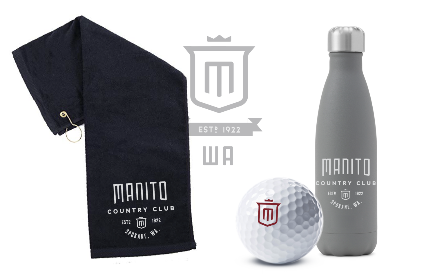
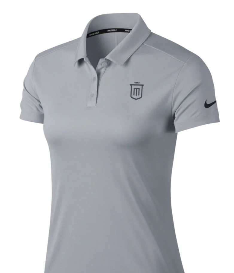
STRATEGY, LOGO, BRANDING, MERCHANDISE

Primary Logo - Before & After Rebrand

The approach
The rebranded mark for Manito Golf Club takes inspiration from the original design, preserving its rich history and distinctive elements while providing a fresh and modern look. The original crest, a well-recognized symbol, featured four quadrants each representing different aspects of the club's identity: a sun, a tree, golf clubs, and a mountain. These elements reflected the club's connection to nature, the sport of golf, and the surrounding landscape.
In the new version of the logo, the shape of the original crest is retained to maintain a sense of continuity and tradition. However, the updated design introduces a bold "M" in the center, symbolizing Manito Golf Club. This central "M" serves as a strong, recognizable emblem that unifies the club's identity. Additionally, a crown has been added back to the top of the crest, where on an earlier rendition of the mark, it was used.
The modernized crest blends tradition with contemporary design, ensuring that it appeals to both long-standing members and new generations of golf enthusiasts. The rebranded mark not only pays homage to the club's heritage but also positions Manito Golf Club for a bright and dynamic future.
Alternate Logos - A scalable system.

Application

Here’s to leaving a legacy.
We’re excited for the future of this storied club and hopeful for the next 100 years of golf for many generations ahead.